
The Evolution of the Moto Guzzi Logo
The Moto Guzzi logo, an emblematic figure in the motorcycle industry, has undergone numerous transformations since its inception. While it has seen nearly ten modifications, its core element, the flying eagle, has remained a consistent and poignant symbol throughout the brand's history, reflecting both its legacy and adaptability.
The birth of Moto Guzzi's emblem is as significant as the company's foundation. Initially conceptualized by three Italian Air Corp members - Giorgio Parodi, Carlo Guzzi, and Giovanni Ravelli - the company was to blend financial stability, innovative design, and effective promotion. However, the untimely death of Giovanni Ravelli in an aircraft accident just after World War I marked a turning point. Guzzi and Parodi decided to honor their comrade's memory by incorporating the eagle into their logo, symbolizing both freedom and remembrance.
Moto Guzzi's journey began in 1921 in a small workshop in the Province of Como. The first logo featured a simple rhombus containing the initials "GP," denoting the founders' surnames. However, it was in 1924 that the emblem took a significant leap with the introduction of the iconic eagle. This early version, characterized by its austere sans-serif typography and a distinct 'U,' laid the foundation for future iterations.


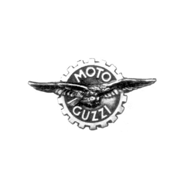
The subsequent decades saw the logo evolve primarily in typography, with variations in font style and color. In 1957, a radical redesign placed the eagle within a notched wheel, a symbol of the company's engineering prowess. The following year, the "Del Gambalunga" emblem emerged, showcasing a modified eagle that stirred some controversy due to its perceived stylistic ties to Fascism.

By 1976, the logo had evolved into a cleaner and more contemporary design, making it more legible and visually appealing. The 1994 version marked a return to the original realistic eagle, accompanied by a textual design reminiscent of the earliest logo, this time enclosed within an ellipse and adorned in red and yellow.


In 2007, the Metalli Lindberg graphic agency introduced a 3D rendition of the medallion, adding a modern twist to the traditional emblem. Today, the Moto Guzzi logo has shed its elliptical frame, reverting to a design that closely resembles the original. Available in either white with a black outline or in red, the current logo stands as a testament to the brand's rich heritage and enduring appeal.


-
What does the Moto Guzzi eagle symbolize?
The eagle in the Moto Guzzi logo is a tribute to Giovanni Ravelli, one of the company's founders who was also a pilot. After his tragic death in an airplane crash just after World War I, the remaining founders, Carlo Guzzi and Giorgio Parodi, decided to commemorate him by featuring an eagle in their logo. The eagle symbolizes not only their fallen comrade but also represents freedom, speed, and the spirit of adventure - qualities that resonate with the essence of motorcycle riding.
-
How has the Moto Guzzi logo evolved over the years?
The Moto Guzzi logo has undergone several changes since its inception in 1921. The earliest logo featured the initials "GP" (for Guzzi and Parodi) in a simple rhombus shape. In 1924, the iconic eagle was introduced, and over the years, the logo has seen variations primarily in its typography and color schemes. Significant changes include the 1957 redesign with the eagle inside a notched wheel, the controversial "Del Gambalunga" emblem in 1958, and the return to a more realistic eagle in 1994. The current version closely resembles the original design, emphasizing the brand's heritage.
-
Why does the Moto Guzzi logo sometimes appear in different colors?
The color variations in the Moto Guzzi logo are part of its evolutionary design process and branding strategy. While the original logo featured more simplistic color schemes, later versions introduced different hues for varying purposes. For instance, the 1994 logo with the realistic eagle was encased in an ellipse colored red and yellow, likely to enhance visibility and brand recognition. The logo has been presented in white with a black outline or in red in its more recent forms. These color choices reflect the brand's adaptability to modern aesthetics while maintaining its historical identity.